 Fresume
Resume templates
Minimalist resume templates, built to pass the ATS
Clean, whitespace-forward layouts with one typeface and a strict hierarchy that keep the focus on your experience and parse reliably. See who they suit and how to design one.
Minimalist resume templates
Clean, whitespace-forward layouts with one typeface and a strict hierarchy that keep the focus on your experience.
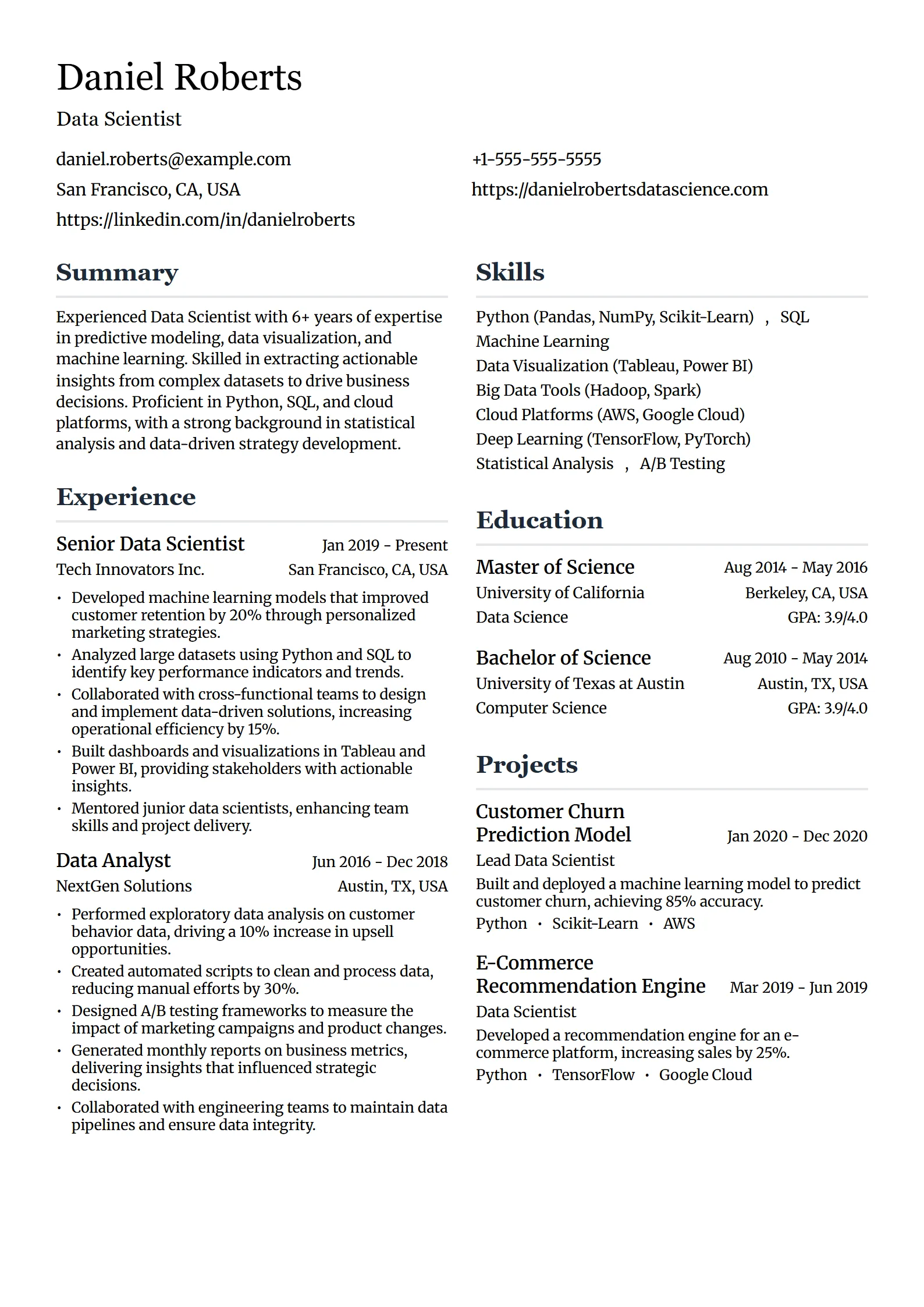
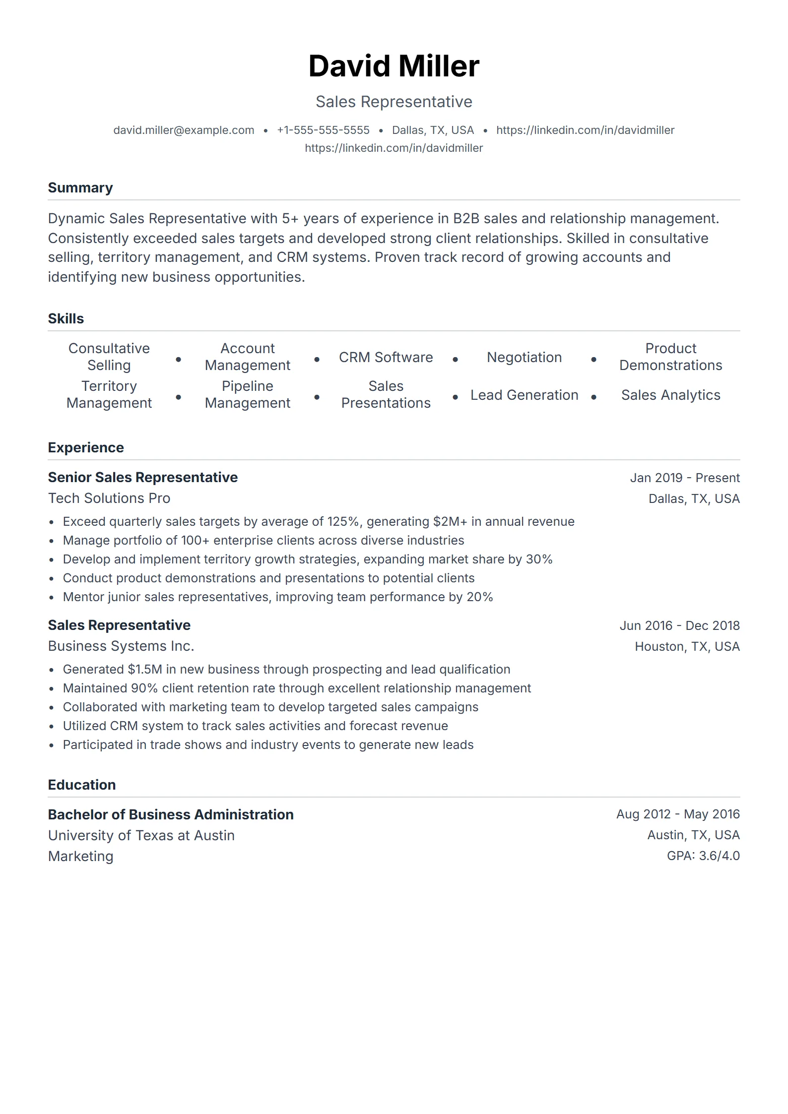
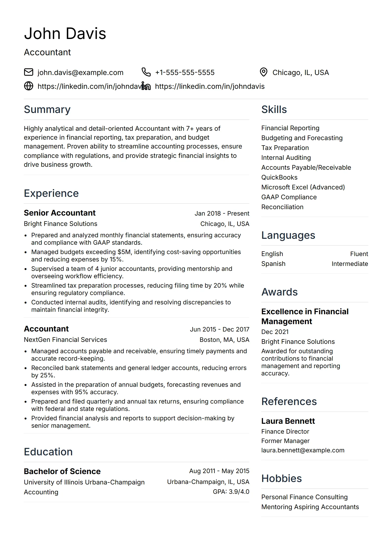
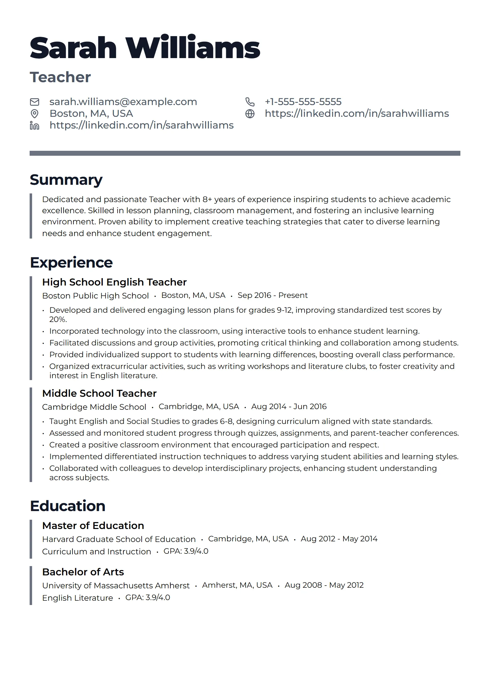
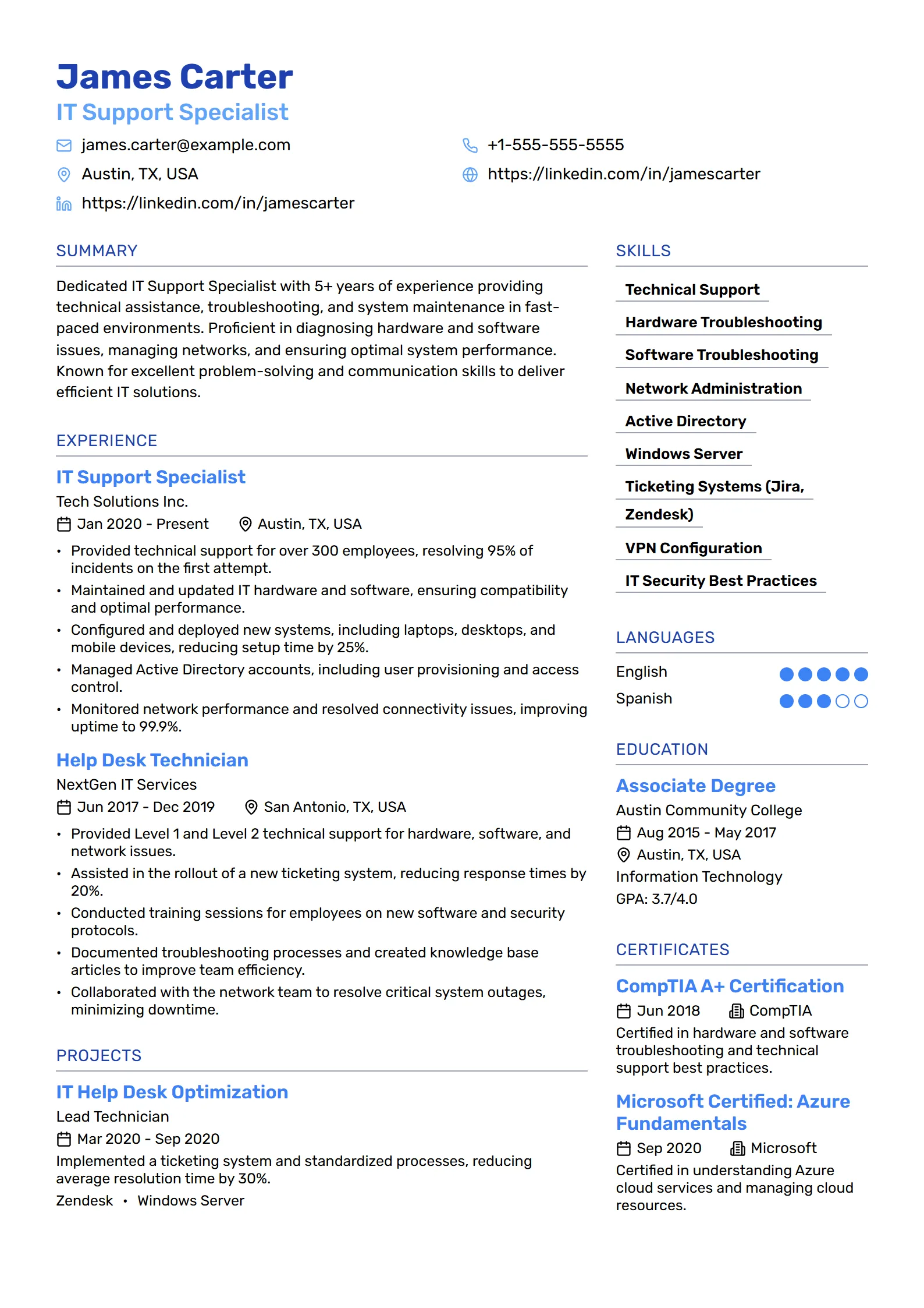
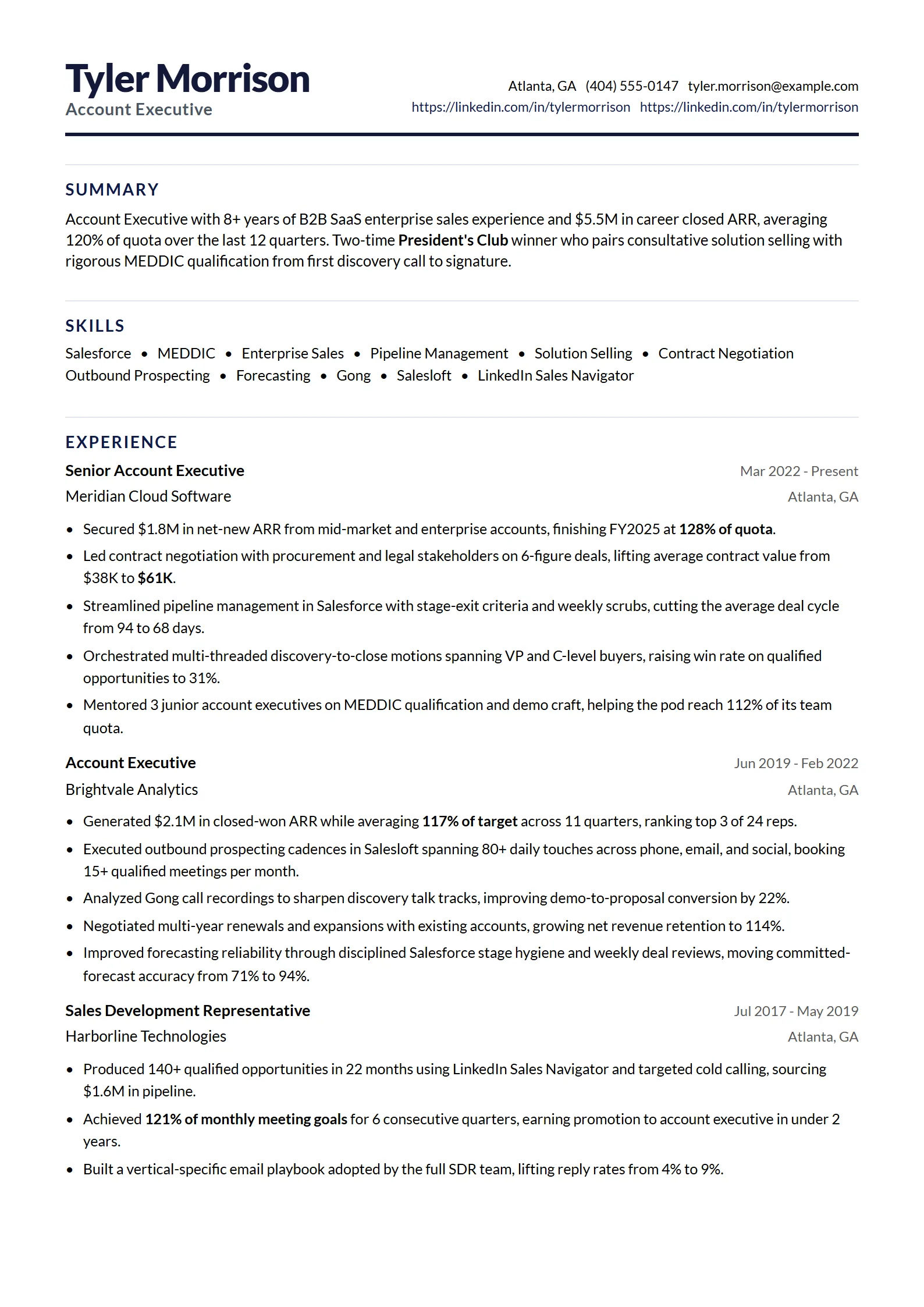
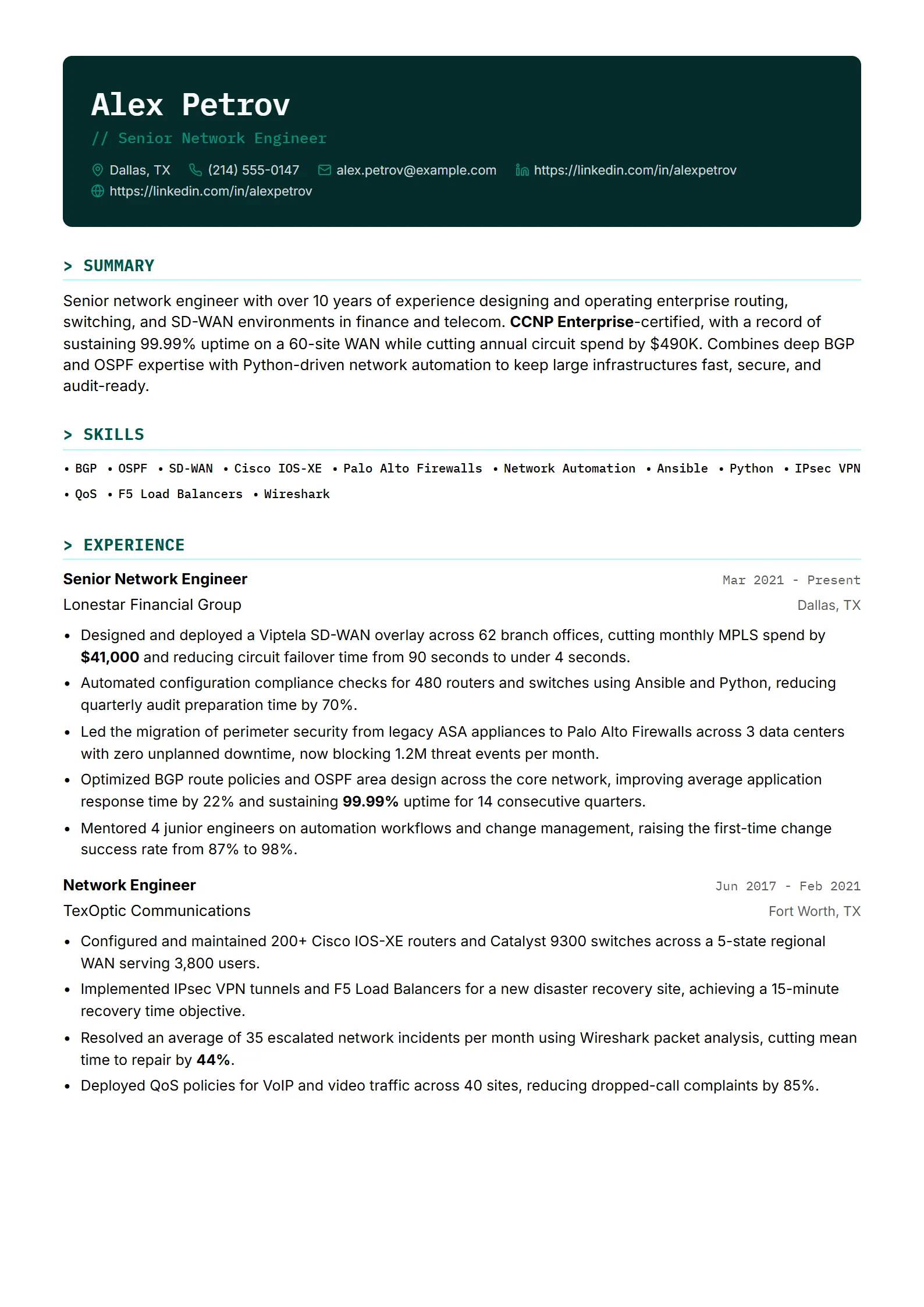
What is a minimalist resume template?
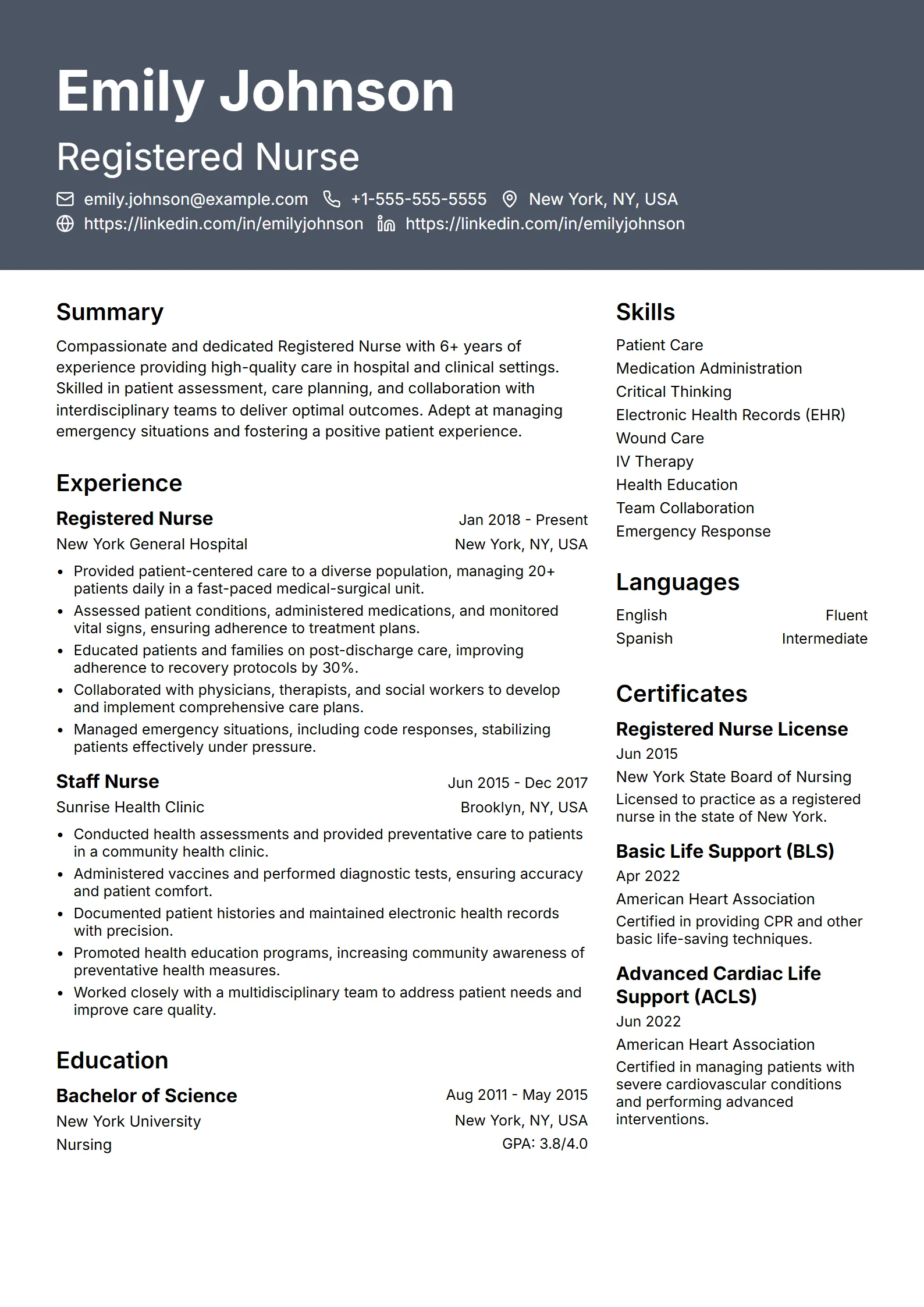
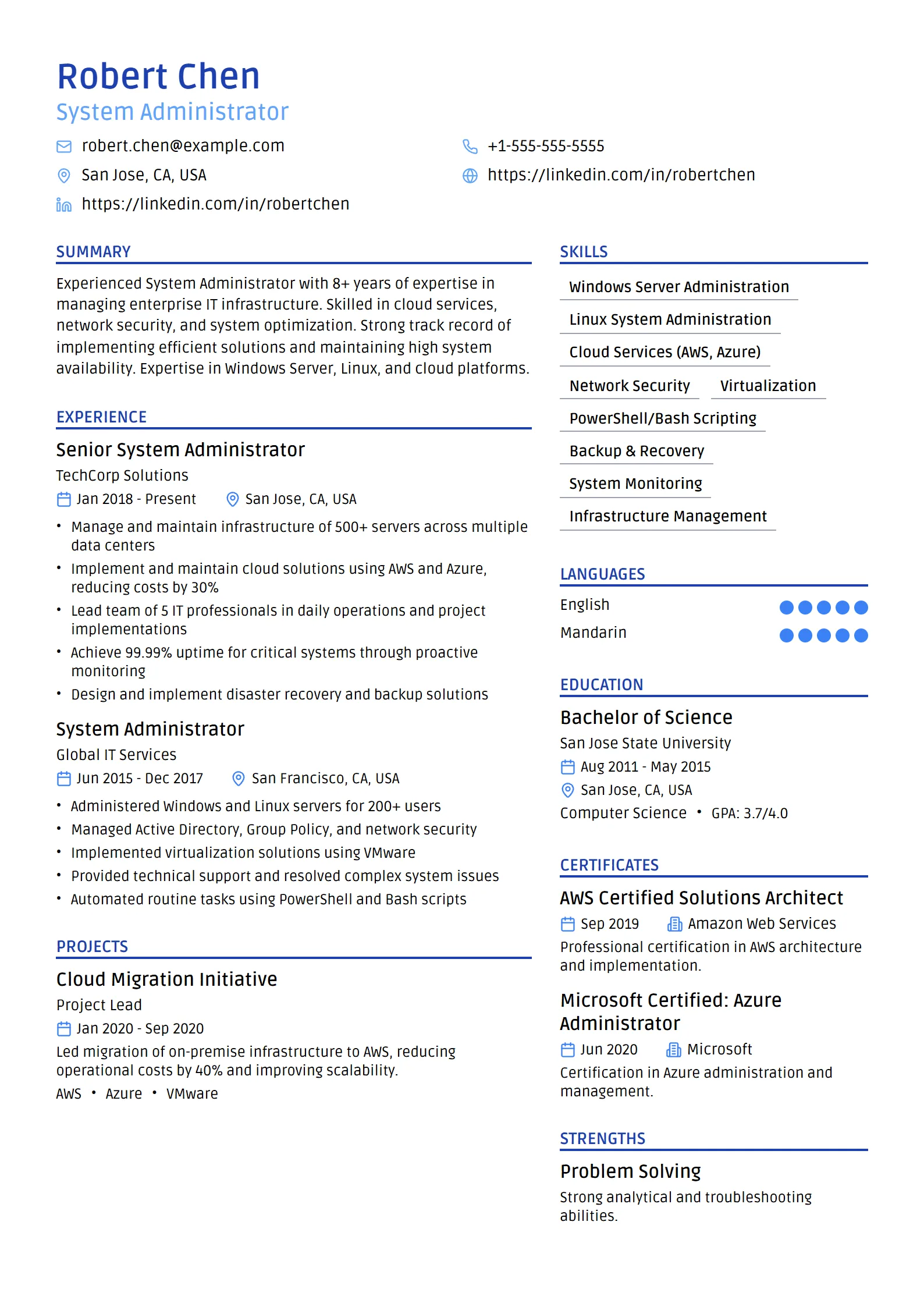
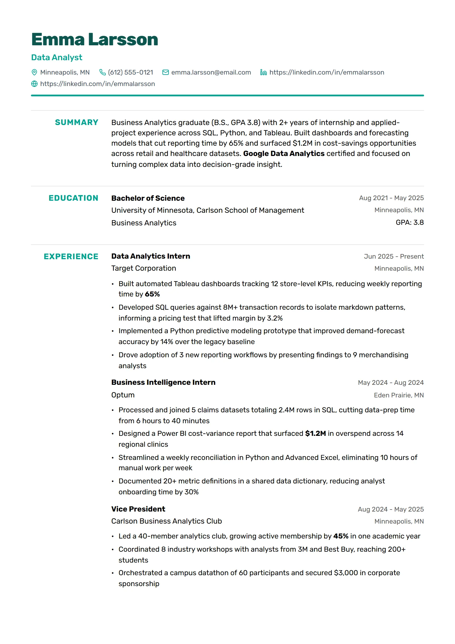
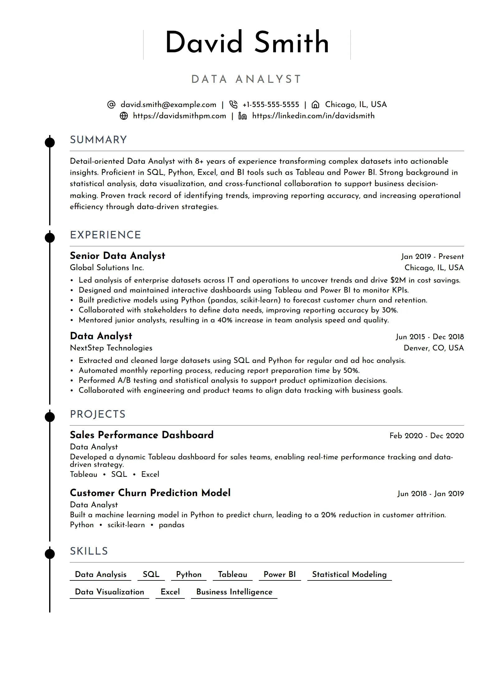
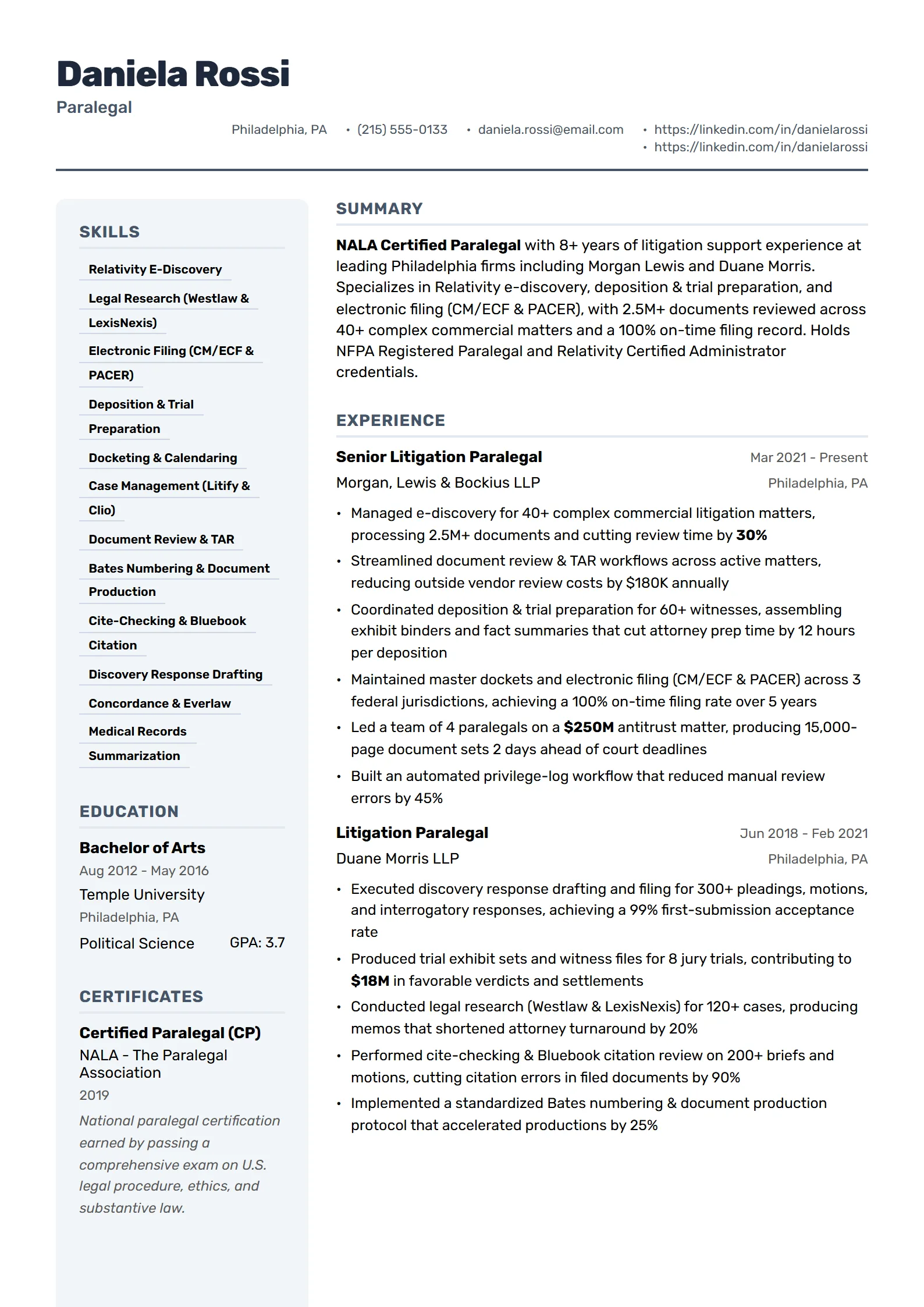
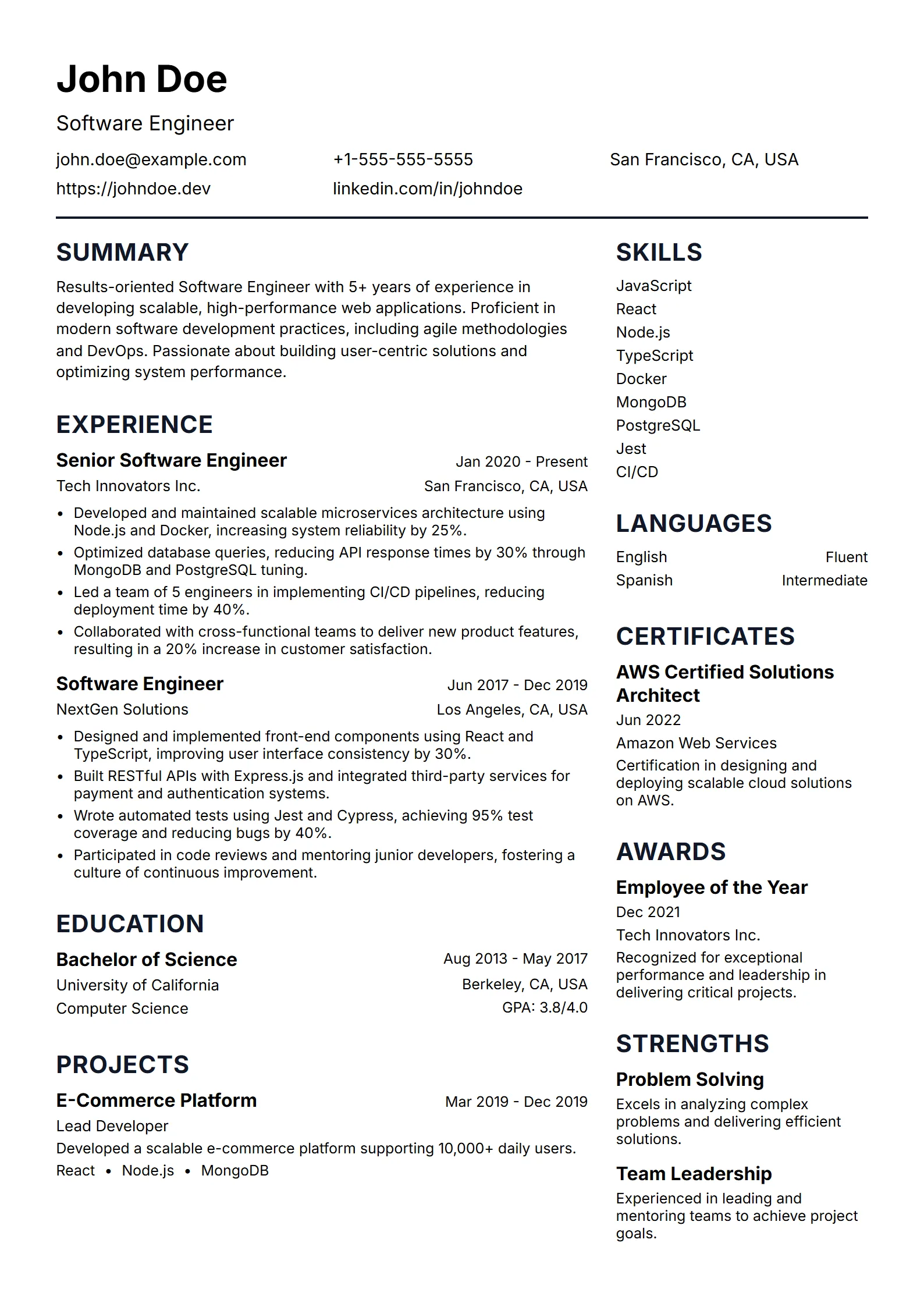
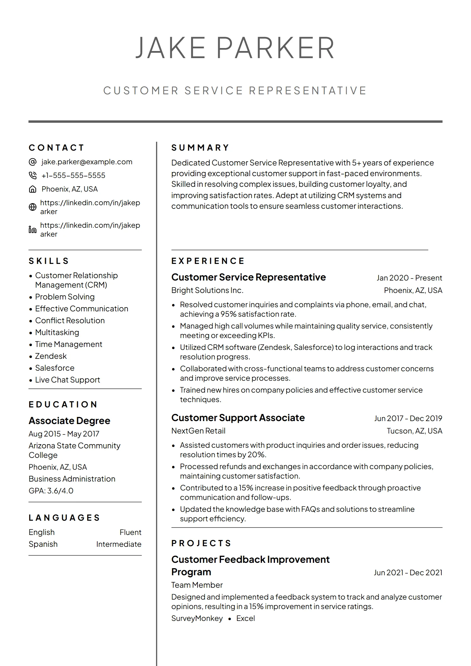
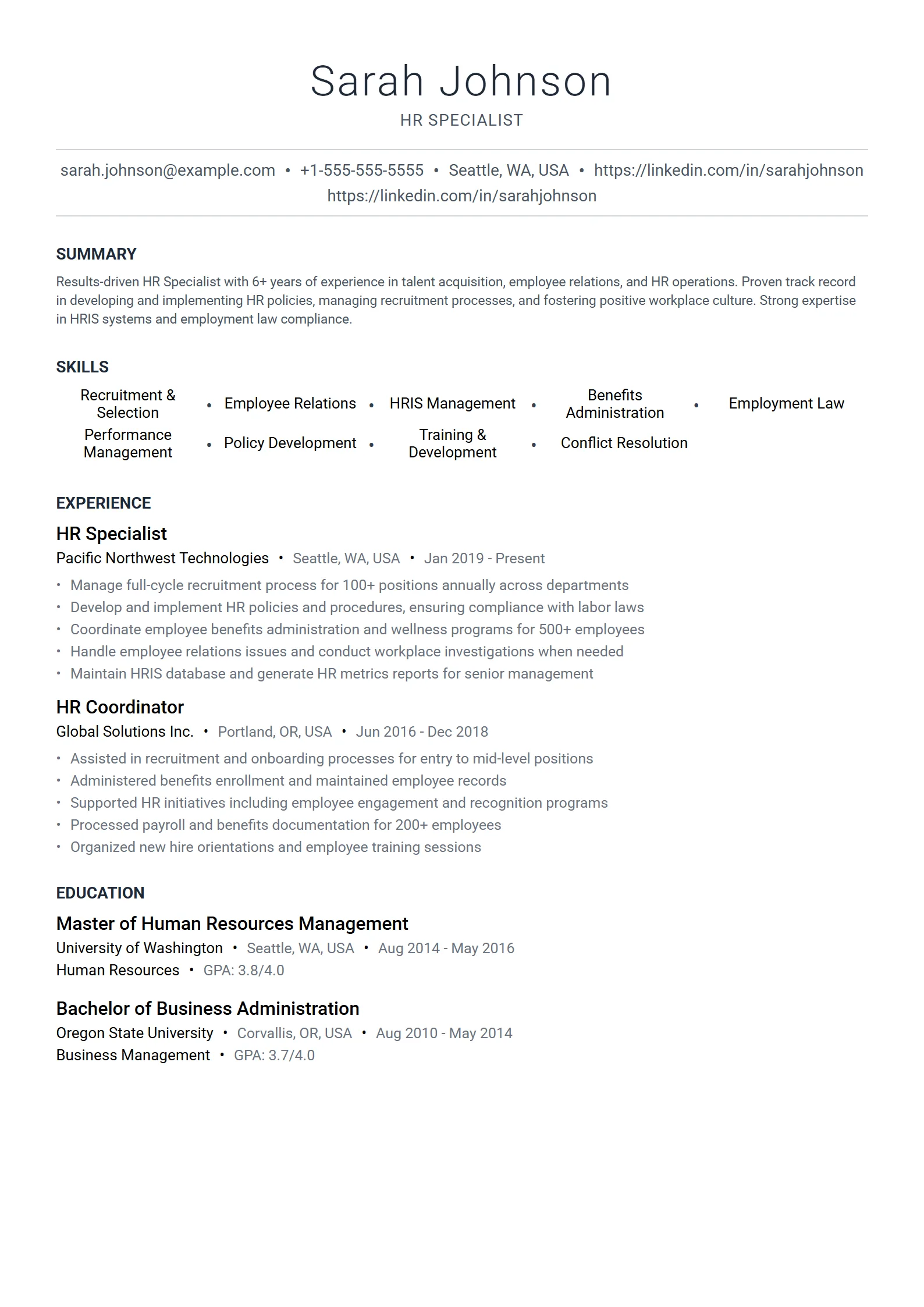
A minimalist resume template is a single-column layout stripped to essentials: one typeface, generous white space, a strict type hierarchy, and plain section headings, with no rules, icons, sidebars, or color blocks. The restraint is deliberate. Nothing decorates the page, so a recruiter’s eye and an applicant tracking system both move straight to your experience and read it in order.
Minimalism on a resume is an editing discipline, not an empty page. Every choice earns its place: a single font family carries the whole document, size and weight do the work that color and graphics do elsewhere, and consistent spacing gives each section room to breathe. The result looks calm and intentional, which reads as confidence — you let the work speak instead of dressing it up.
Because a minimalist layout is text-first and single-column, it is also one of the safest formats for online applications. There are no tables or text boxes to scramble when the file is parsed. If you want to see how a clean layout compares with bolder, more visual options, browse the full set of resume templates and pick the structure that fits your field.
Minimalist, simple, or basic — which do you need?
The three terms overlap, and for most job seekers the practical answer is the same clean, single-column file. The difference is emphasis. Minimalist describes a design philosophy: maximum white space, one typeface, and a strict hierarchy where restraint is the point. Simple and basic describe plainness of content and structure — an easy-to-read format that puts substance first without much styling either way.
If you searched for “minimalist,” you probably care about how the page looks and feels: composed, uncluttered, design-led. If “simple” or “basic” is closer to what you want, our simple resume templates cover that angle directly. Want a little more visual character while staying single-column and ATS-safe? Compare the modern resume templates. Whichever label fits, the underlying rule holds: keep it single-column, keep the text real, and keep the structure predictable.
Who should use a minimalist resume template?
A minimalist template suits almost anyone applying online, and it is the strongest choice when you want a composed, senior-looking document that still parses perfectly. Reach for a minimalist layout when:
- You are applying through an online portal or job board, where an ATS parses your file before a person reads it.
- You work in a field where restraint signals seniority — consulting, finance, law, medicine, engineering, or executive roles.
- You have strong, quantified experience and want nothing on the page competing with it for attention.
- You are early in your career and want a short history to look deliberate and complete rather than sparse.
- You are changing careers and need a clean summary and skills section to connect your background to the new role.
The main time to reconsider is a design-led role — brand, UX, or advertising — where a recruiter opens your PDF directly and expects visual personality. Even then, keep a parseable version for online forms, and confirm any bolder layout with our ATS-friendly resume guide before you send it.
How do you design a minimalist resume that still passes the ATS?
To design a minimalist resume that passes the ATS, build it as one column, commit to a single typeface, use white space and type weight instead of graphics for hierarchy, keep standard headings, and export a text-based PDF. The look comes from what you leave out — no rules, icons, sidebars, or color blocks — not from anything the parser cannot read.
- Start single-column. Put every section in one top-to-bottom flow so the parser reads exactly what a recruiter reads.
- Commit to one typeface. Set body text at 10.5–12pt and your name at 16–20pt; let size and weight, not color, create the hierarchy.
- Give it white space. Use roughly 1-inch margins, comfortable line spacing, and consistent gaps between sections so the page feels calm.
- Keep headings standard. Summary, Skills, Experience, Education — plain labels the ATS recognizes, never creative ones like “My Journey.”
- Cut every decoration. No icons, rules, sidebars, color blocks, or skill-rating bars; type contact details as plain text, not icons.
- Lead with results and export a PDF. Open each bullet with a number or outcome, then save a text-based PDF so the layout holds and the text stays selectable.
Fresume does not hand you a file to format by hand. The minimalist, ATS-safe structure is already built into the builder: you pick from 50+ templates, drop in your details, and export a clean PDF, while the free ATS resume checker flags parsing issues and missing keywords against the exact job description. There is a free plan, with premium features at $17.49/month. To see how real candidates fill a clean layout, study our resume examples by job title first.
Minimalist resume design principles
Minimalism is a set of small, consistent decisions. Follow these and the page looks intentional instead of empty; break them and it slips into either clutter or blankness. Fresume templates hold most of these for you, but knowing the rules helps when you customize.
| Element | Minimalist choice | What to skip |
|---|---|---|
| Typeface | One clean sans or serif used throughout | Mixing two or three competing fonts |
| Color | Near-black text on white, one restrained accent at most | Color blocks, shaded sidebars, gradients |
| Structure | Single column, standard headings, reverse-chronological | Two columns, sidebars, tables to align dates |
| White space | Generous margins and line spacing that let sections breathe | Cramming to fit or padding to fill the page |
| Emphasis | Size and weight for hierarchy — bold role, lighter dates | Underlines, icon rows, and decorative rules |
| Contact details | Plain, selectable text on one line | Icons standing in for phone, email, or location |
Tip: White space is content, not wasted room. If the page feels bare, tighten the writing rather than adding graphics — stronger, more quantified bullets fill a minimalist layout far better than any decorative element could.
Questions
Frequently asked questions
01Is a minimalist resume template ATS-friendly?
Yes. A minimalist template is single-column with standard headings and real, selectable text, which is exactly what applicant tracking systems read most reliably. The clean look comes from white space and typography, not from tables, sidebars, or graphics, so there is nothing on the page for a parser to scramble. It is one of the safest formats for any online application.
02What is the difference between a minimalist and a simple resume template?
Very little in practice — both are clean, single-column, content-first layouts. “Minimalist” leans on the design idea of restraint and white space, while “simple” and “basic” describe an easy-to-read, no-frills structure. They point to the same ATS-safe file; the label just reflects whether you care more about the look or the plainness.
03What font is best for a minimalist resume?
Use one clean, widely available typeface throughout — a sans such as Calibri, Arial, or Helvetica, or a restrained serif such as Georgia or Cambria. Set body text at 10.5 to 12pt and your name a few points larger, and build hierarchy with size and weight rather than a second font. Consistency is what makes a minimalist page look composed.
04Does Fresume have free minimalist resume templates?
Fresume has a free plan, and its minimalist, ATS-safe templates live inside the builder rather than as downloadable files. You choose a clean layout, fill in your details, and export a text-based PDF, while the free ATS checker reviews your resume against a specific job description to catch formatting issues and missing keywords. Premium features are $17.49/month.
05Is a minimalist resume too plain for creative or senior roles?
No. For senior roles, restraint reads as confidence — scope, budgets, and results carry the page, and a calm layout makes them easy to find. For most creative roles a clean resume still works, with your portfolio doing the visual talking. The one time to add more character is a design role where a recruiter opens your PDF directly rather than through an ATS.
Build a clean, minimalist resume.
Start from a minimalist template, tailor it, and check it against the job before you apply.